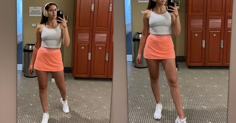
Matching sets can look so good, or they can very quickly read like “I just threw this on and called it a day.” And tbh, it usually has nothing to do with the brand or logo.
Most of the time, it comes down to four things:
Fabric, fit, finishing and styling.
When those pieces all hit, the set looks super intentional. When they don’t, it can lean a little too loungey – even when the set itself is cute.
Of course, you don’t want to style it so much that it loses that comfy, effortless feel.
The quick version
If you want a matching set to look more elevated, I’d focus on these few simple things:
- Choose denser fabric (not necessarily the warmest, just the least flimsy). Fabric weight is often listed as GSM (grams per square meter). Higher GSM usually means thicker and denser.
- Prefer structured knits for a “rich” look: French terry (loop-back) tends to look cleaner than fuzzy fleece, and ponte/scuba-style double knits hold shape well.
- Fit check: shoulders, waistband, hems. If any of those look off, the whole set looks cheaper.
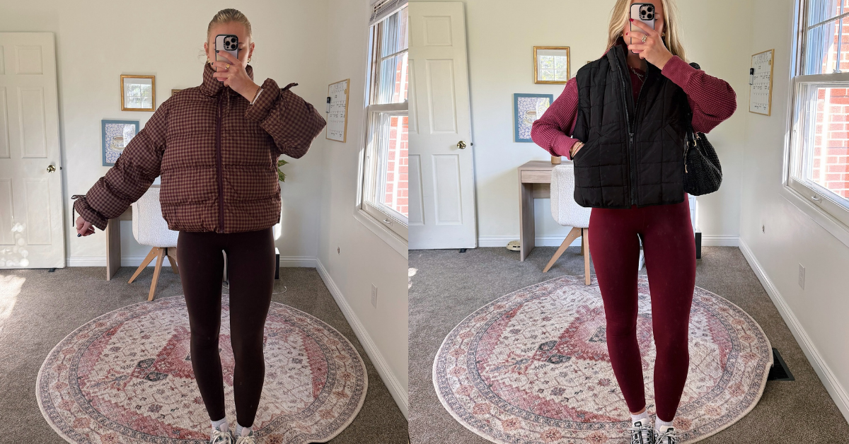
- Add one “adult” piece: coat, blazer, trench, or crisp shirt. The “third piece” concept exists for a reason.
- Upgrade the details: clean shoes, minimal jewelry, a structured bag, tidy hair.
- Care matters: wash inside out, gentle cycle, reduce friction to avoid pilling.
And if you only do one thing, do this:
Wear the set in one calm tone and throw on a structured outer layer. That alone already does so much.
The main thing that makes a set look expensive
The biggest difference, in my opinion, is shape.
A matching set always looks way more elevated when it has a little structure and actually holds its shape. Not in a stiff or uncomfortable way, obviously – just enough that it doesn’t totally fall flat and you can tell the silhouette was meant to look like that.
That’s also why I’ll always say it makes more sense to buy one really good set instead of five random ones that literally lose their shape the second you wash them.
Because tbh, no amount of styling is gonna fully save a set when the base already looks flimsy.
Fabric makes a huge difference
1) Know what GSM is (and what it is not)
GSM is simply a standard way to describe fabric density: grams per square meter. Higher GSM usually signals a thicker, denser fabric.
But heavier does not automatically equal higher quality. Fiber, knit structure, and finishing still matter.
Practical takeaway: use GSM as a quick filter, then confirm quality with feel and construction.
2) Some fabrics naturally look more polished
I’ve noticed that certain fabrics just read more elevated right away:
- French terry (loop-back): smoother outside, loops inside. Often looks cleaner and more “daytime wearable” than fuzzy fleece.
- Fleece (brushed inside): cozier, but the fuzz can read more casual and it can look worn faster if it pills.
- Ponte (double knit): thicker, stable, holds structure. Great when you want a set that looks almost tailored.
- Scuba knit (double knit): smooth, structured, slightly “tech” vibe, holds shape.
This won’t work if you run hot and the only sets you’ll actually wear are lightweight. In that case, pick lighter fabric but get extra strict about fit and finishing.
3) What I personally look for when shopping
When I’m looking at a set, I usually check a few little things:
- A fabric that looks matte or softly brushed, not shiny-thin
- No rippling at seams (a sign the knit is too flimsy or poorly sewn)
- Ribbing that feels springy, not stretched out already
- Waistbands with enough width to lay flat
Fit is where a matching set can really win or lose
Even a beautiful set can look off if the fit isn’t right.
1) Shoulder placement (tops)
If the top fits nicely through the shoulders, the whole set already looks cleaner. If the shoulder line drops too far or the top is way too oversized in every direction, it can start reading a little too pajama-ish.
An oversized fit can still look great, but it usually looks better when there’s still some shape somewhere else in the outfit.
2) Waistband behavior (bottoms)
A set looks cheaper when the waistband:
- rolls
- bunches under the top
- creates a visible “dip” because it’s too tight
- collapses because elastic is weak
Easy fix: choose bottoms with a wide, stable waistband and enough rise to sit where you actually want it.
3) Hem length and shape (bottoms)
- Joggers look sharper when the cuff isn’t overly tight and the leg isn’t ballooning.
- Wide-leg knits look expensive when they skim, not puddle.
Small tailoring tip: hemming knit pants is one of the highest return tweaks you can make.
How I style matching sets so they look more polished
This part is actually much easier than people make it seem.
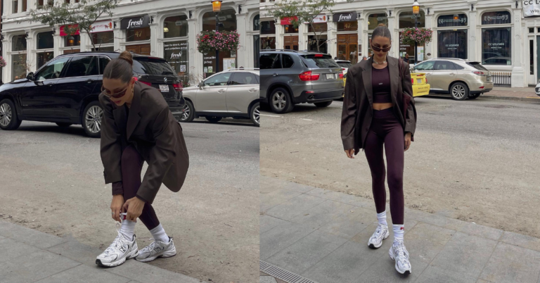
The “third piece” trick
If there’s one styling trick that works almost every time, it’s adding one more intentional layer.
That can be something like:
- a long wool coat
- a trench
- a blazer
- a crisp button-up worn open
- a leather jacket
That extra layer instantly makes the set feel more finished and more like a proper outfit instead of just loungewear.
And yes, this really is one of those little tricks that does a lot of the heavy lifting.
Formula 1: Tonal set + coat + clean sneaker
- Matching set in one tone (cream, charcoal, navy, espresso)
- Long coat
- Minimal sneaker
It works because the tonal look already feels intentional, and the coat adds shape and polish.
Formula 2: Set + blazer + sleek shoe
- Matching set
- Blazer (even slightly oversized works)
- Loafer or clean sneaker
This is the “I’m comfortable but I have standards” outfit.
Formula 3: Set + crisp shirt + simple jewelry
- Matching set
- Button-up shirt worn open (or tucked loosely in front)
- Small hoops or a chain
This is optional. Skip it if button-ups annoy you or feel fussy. The set can still look expensive with a coat and good shoes.
Formula 4: Knit set as a “soft suit”
If your set is ponte or scuba-like, treat it like a casual suit:
- add a structured bag
- keep the shoe clean and minimal
- keep accessories understated
The details that quietly make everything look better
Shoes
The fastest way to ruin a good set is worn-out shoes. Pick:
- clean leather sneakers
- minimal retro sneaker
- loafers
- sleek ankle boots
(You can absolutely do sporty sneakers, but keep them clean and not overbuilt.)
Bag
A structured bag will almost always make a matching set look way more intentional. A super slouchy tote can still be really cute, obviously, but it usually pulls the whole outfit in a much more casual direction.
So if you want the set to feel a little more elevated, the bag is honestly one of the easiest ways to do that.
Hair and grooming
You don’t need glam. You need “deliberate”:
- low bun
- ponytail
- clip twist
- clean part with natural texture
How to keep your matching sets looking good after washing
One of the biggest things that can make a set stop looking cute is pilling and fuzz.
So tbh, I always think it’s worth being a little extra careful when you wash it.
I’d turn it inside out, wash it on a gentle cold cycle, and keep it away from rougher fabrics or anything with zippers, because that kind of friction literally makes such a difference. That alone helps a lot.
Because honestly, sometimes a set doesn’t even need better styling – it basically just needs better care.
A few easy ways to style them depending on the vibe
If you want “quiet luxury”
- tonal set (cream, camel, charcoal)
- long coat
- loafer
- minimal jewelry
If you want sporty-polished
- set + bomber or trench
- clean sneaker
- baseball cap (only if it looks crisp, not sweaty)
If it’s hot out
- lightweight knit set, but keep it less clingy
- swap coat for an overshirt
- sandals that look intentional (not beach-flip-flop)
The only thing I’d say here is that lighter sets do wrinkle more easily and often cling more, so that’s kind of the trade-off. They can still look great, you just have to be a little more careful with the fit and styling.
FAQ
Does heavier fabric always mean better?
Not always, but it usually helps the set look more polished because it has more structure. The quality still depends on the fabric itself and how well the set is made.
Which fabrics usually look the most elevated?
From what I’ve seen, ponte, scuba-style knits, and good French terry usually look the most polished because they hold their shape better.
How do I make a fleece set look less casual?
I’d keep everything else cleaner and sharper. Add a coat or blazer, wear better shoes, and go for a more structured bag. That balance helps a lot.
What’s the biggest fit mistake?
Usually it’s when the top is too oversized and long, and the bottoms also bunch up or lose shape. Then the whole outfit kind of loses its silhouette all at once.
What helps the most if I only change one thing?
I’d add a structured outer layer first. And after that, probably a better bag.
Just a little note - some of the links on here may be affiliate links, which means I might earn a small commission if you decide to shop through them (at no extra cost to you!). I only recommend and mention products I truly stand behind and that I've tested myself.
And as you know, I seriously love hearing from you - that means the world to me! If you recreate something, feel free to share it here in the comments or send me a message. I'm always excited to connect with y'all! ✨🤍
Xoxo Luna